Make an MS Word Doc Accessible
HTML pages achieve accessibility better and more consistently than Word files and should always be your first choice whenever possible. The most common reasons to use Word files are to:
- You are publishing a fillable document that can be returned.
Note: Many departments are now using Outlook 365 Forms App for this purpose. These are certainly friendlier and easier to submit than downloading a Word doc and submissions are emailed straight to your inbox or downloaded later. It is straightforward to create and share by adding the link to the form on your website. - You are publishing changeable documents that can be used by faculty or staff
Word and PDF documents should never be used for ordinary content. If you must publish a Word or PDF document to the website, it must still legally meet all of the same accessibility requirements as an HTML web page. This includes header structure, text spacing, readability and logical reading order, tab order, bookmarks, color contrast, image alt tags, language settings.
Run the Accessibility Checker
The accessibility checker that is built into Word is a great tool to help identify potential problems with your document. Be advised that the criteria for the accessibility checker do not correspond to any accessibility standard. In other words, satisfying the accessibility checker does not ensure that you are meeting WCAG 2.0, AODA, ADA, or Section 508 requirements.
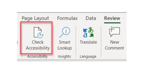
Some versions have the Check Accessibility button located under the "Review" tab.
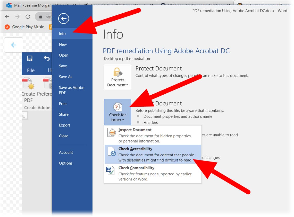
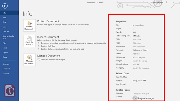
Some versions have the Check Accessibility button located in the "File Info" section.
Follow the Help Text for Correcting Accessibility Errors
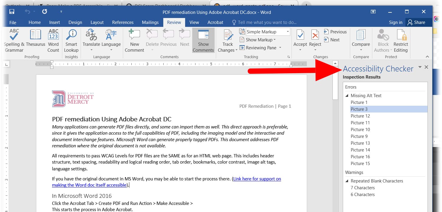
A list of accessibility errors will appear. Microsoft typically shows how to fix them below the list.
Checklist: Accessibility problems in a Word Document
Text justification
Left aligned text is the most readable type of text. For body text, do not use justified or centered alignment.
Set the text wrapping for all non-text elements, such as images, graphs, charts, diagrams etc. to be ‘in-line with text’. This helps with reading order by assistive technologies. For decorative images, this doesn’t really matter.
Avoid using the text-boxes function. These are floating objects and often cause reading order problems for assistive technologies.
Never use tables to set the layout of a page.
Paragraph spacing
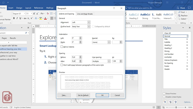
Avoid using empty carriage returns (pressing enter multiple times) to create blank space. Adjust the paragraph spacing instead. Set these line spacing options for paragraphs properly then update the “Normal” style. This makes it possible to always use the same formatting for every paragraph that will be created in the document.
To adjust the line spacing between individual paragraphs, go to “Home” tab on the ribbon and open the “Paragraph” dialogue box. Alternatively, you can right-click on the text and open the Paragraph dialog box from there. Use the before and after spacing settings.
Accessible links
Links should provide users with the proper context of where clicking the link will take them. Phrases such as “click here,” “read more,” “click for details,” and so on are ambiguous when read out of context. Provide helpful clues to the content to which they lead.
Do not leave link text as a raw URL. Screen-readers read URLs letter by letter so it isn’t friendly.
Use a screen tip, found inside the hyperlinks dialog box, to provide an alt-text for the link.
Where possible, avoid using internal document links. The functionality of these for assistive technologies is not great.
Links going to the same location should use consistent wording for the link.
Heading structure
Word offers many default heading levels on the “Home” tab, in the “Styles” group, found on the ribbon. You can set your own formatting style if you do not wish to use the default styles provided by right clicking the style and choosing ‘Modify’.
- Use Heading 1 for your title page. Using more than one Heading 1 does throw an error when you convert to PDF.
- For the table of contents heading, use the TOC Heading style.
- Use Heading 2 as top-level heading such as chapter or section titles.
- Use Heading 3 as sub-heading to Heading 2, Heading 4 as sub heading to Heading 3.. etc.
- You should only go forward one level at a time. (i.e. moving from Heading 2 to Heading 4 would not be acceptable).
- You can go backwards in multiple steps (i.e. Heading 4 to Heading 2.).
Table of contents
If your document is over 20 pages, create a table of contents. This can be done on the ‘References’ tab. The table of contents which is generated follows the hierarchical order of the headings used in the document.
If you are exporting to PDF, be sure to check “Create bookmarks using: Headings” in the export options.
Headers & footers
Headers and footers are generated by Microsoft Word and are not read by assistive technologies such as screen readers. Do not include any relevant information in them. They should be used for decorative purposes only. One exception is page numbering, which can be put in the header or footer.
Footnotes and endnotes
If you have footnotes or endnotes, use the built-in formatting tools in Word to add them. Do not add them as normal text at the bottom of pages, or in footers. To create a footnote, go to “References” tab on the ribbon, then click on the “Insert Footnote” button. Try to limit footnotes or endnotes to one per page. Multiple footnotes or endnotes can confuse the reading order for some assistive technologies.
Add metadata and set the language
You will need to set the language for the document. You can find the language settings on the Review tab, or on the status bar at the bottom. If there are some parts of your document in different languages, you can set the language for specific selections by highlighting the text and adjusting the language for the selection only.
Fill in the metadata for your document. The document metadata is located in the file properties (author, title, tags and comments). While most metadata is useful, you must fill out the Title field.
Alt-text descriptions
You will need to add alt-text descriptions for all non-text elements in your document.
Alt texts are applied to non-text elements such as:
- Images / Photos
- Charts
- Diagrams
- Icons
- Infographics
- Graphic Advertisements
- Tables (especially holding critical data)
- Lengthy URLs (that are too long or complicated to be read out character by character)
- Forms
- And more.
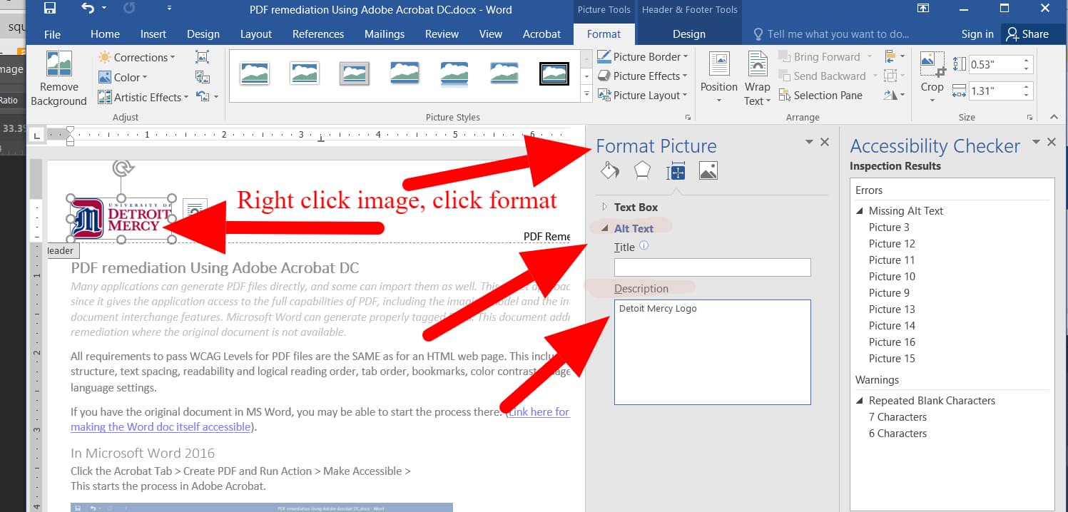
Adding Alt Text to images is the most common thing to fix
- Right click image
- Click Size and Properties
- Expand Alt Text section
- Type in the Description Field
Images, charts, graphs, diagrams
- Make them as simple as possible.
- Use captions to support charts, diagrams, graphs and images that convey meaning.
- Make sure that the captions add value to the reader who may be unable to see them.
- Communicate the insights that each is by writing a summary of the information that is being conveyed.
- Ensure that color or contrast is not the only means of communicating a result in a chart or diagram. Consider patterns instead.
Tables
Tables should be used to represent tabular data, never to layout text on the page. Keep your tables as simple as possible.
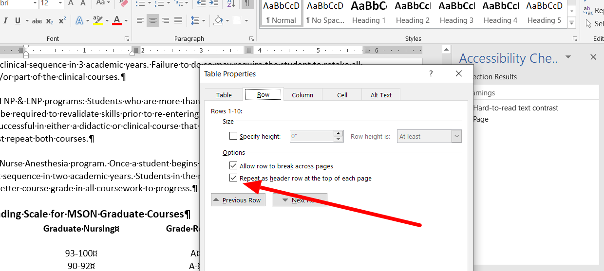
Define the header rows for the table and repeat the header row at the top of each page (set these in the table properties).
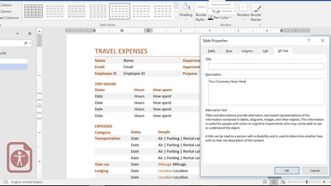
Provide a caption or summary of the information presented in the table. Also found in Table properties in the Alt Text tab.
- Use the table tools to create tables and not the ‘Draw Table’ option.
- Avoid merging and splitting cells.
- Test your table by selecting the first cell of your table and then pressing the tab key. The focus should move across the row and then to the first cell next row down.
Check the color contrast
Ensure that there is enough contrast between the text color and the background color. This includes all text, images, charts, graphs etc. You should aim for at least a 70% difference in color value. Use a color contrast analyzer when in doubt.
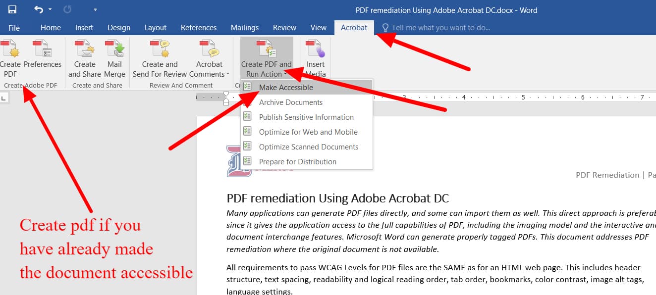
Converting to a PDF
- Always convert your document to a Tagged PDF instead of "printing" it to a PDF File. This will transition your tags and alt text over to your pdf file, saving you the time of doing the exact same process within your pdf document.
If options appear, choose PDF/UA (The standard contains specifications for accessible PDF documents, as well as conforming PDF readers and assistive technologies. The goal of the PDF/UA standard is for everyone to be able to independently access information contained within a PDF document).
Before publishing, you should still open your PDF in Adobe Acrobat Pro and run an accessibility check. If you have started with an accessible Word document, then manual tagging should not be necessary.
- If options appear, choose PDF/UA
- Before publishing, you should still open your PDF in Adobe Acrobat Pro and run an accessibility check.
If you have started with an accessible Word document, then manual tagging is usually not necessary.